Branding · Logo Design · Print & Digital Collateral · Photography
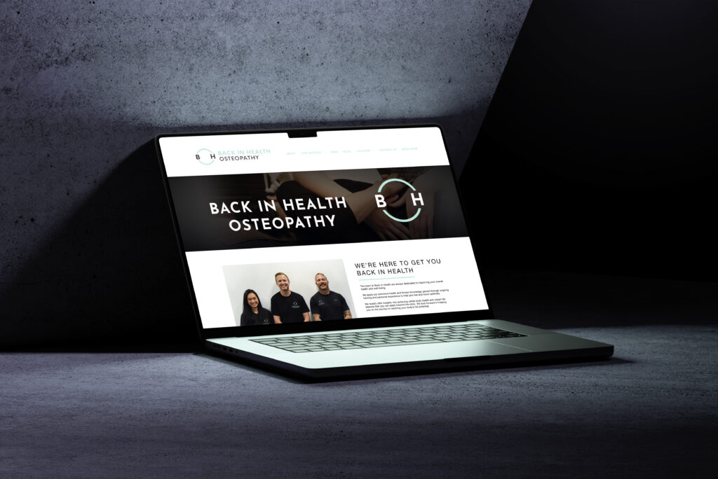
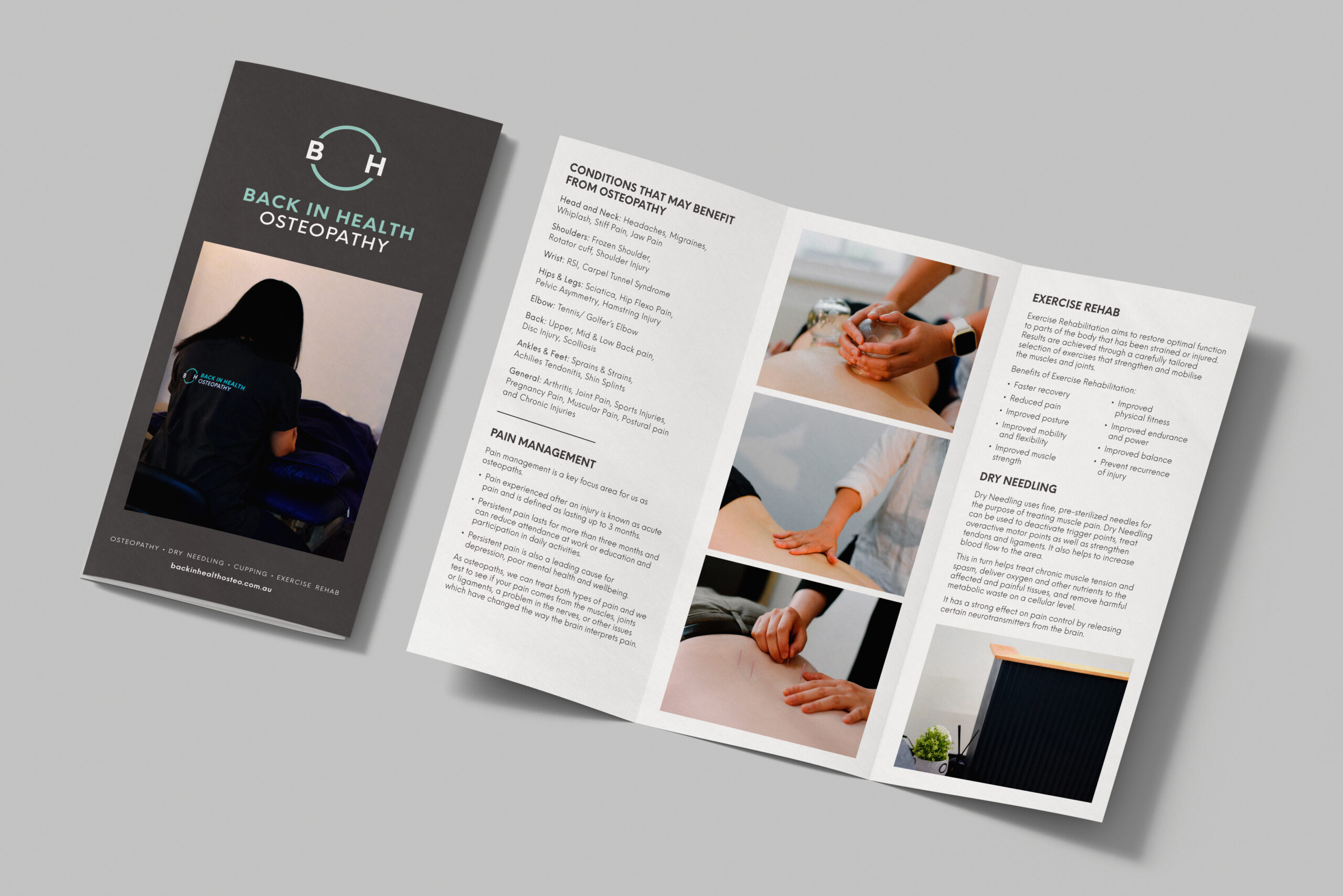
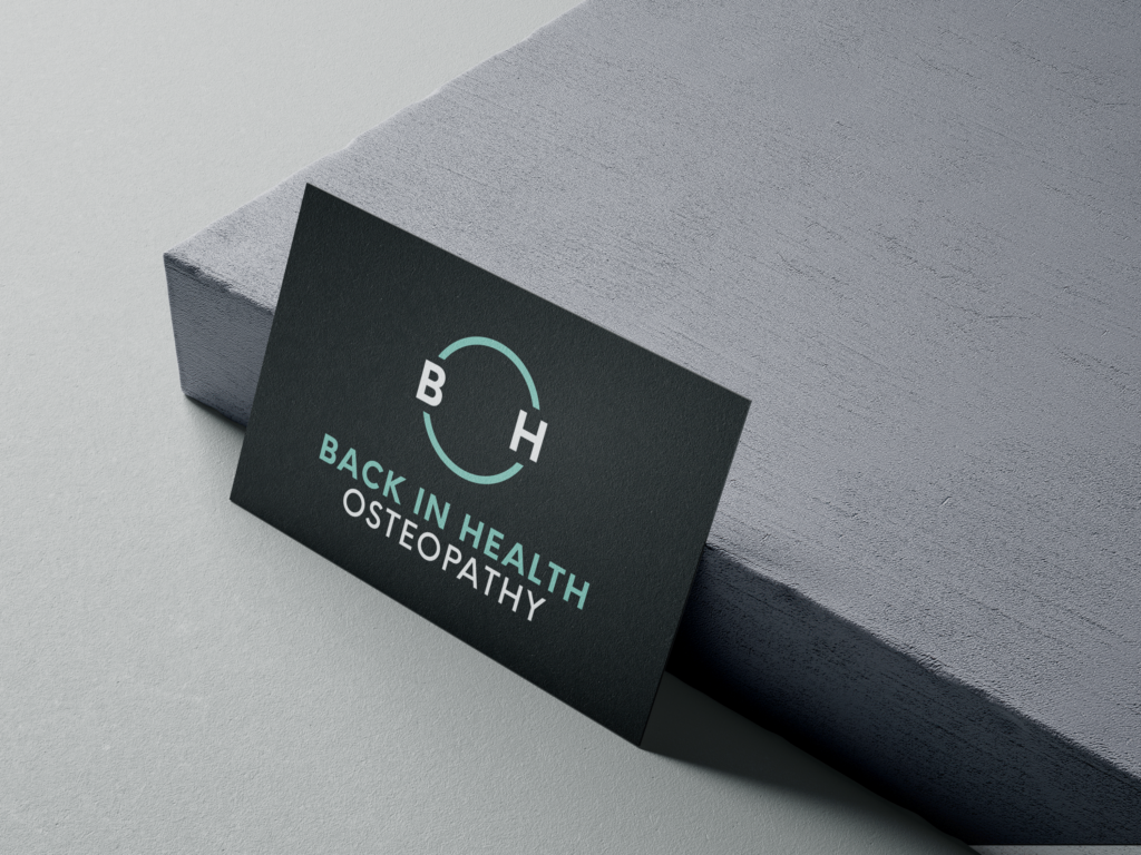
A Melbourne Osteopathy Clinic, Back in Health, needed a re-brand as their previous logo was old and outdated. They wanted a simple yet strong brand that reflected their ‘everything–is–connected’ approach to healthcare. The circle shows movement and the cycle of ‘getting back into health’ whilst also representing connection and simplicity. After the brand identity, I created business cards, flyers and other print and digital marketing collateral for the business and photoshoots of the location and the team.